Mau coba menu Spinny leaf Keren untuk blog sobat?, Menu ini mirip Menu Rolling Ala Goyang Ayu ting ting Tanpa panjang kata silahkan sobat ikuti langkah-langkah berikut ini :
Pertama
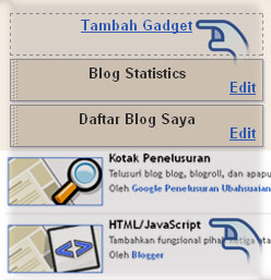
Klik +
Jangan Lupa DOWNLOAD Template Lengkap untuk menjaga kesalahan
Kedua
Cari kode </head> dan setelah ketemu silahkan letakkan kode berikut di atas kode </head>
Kedua
Silahkan Simpan dulu
Ketiga
Klik + Pilih
Silahkan Copy dan Paste Kode Berikut ini
Klik +
Jangan Lupa DOWNLOAD Template Lengkap untuk menjaga kesalahan
Kedua
Cari kode </head> dan setelah ketemu silahkan letakkan kode berikut di atas kode </head>
<style type="text/css">
nav {
width: 960px;
height: 100px;
margin: 120px auto;
text-align: center;
}
.top-menu li {
display: inline-block;
text-align: center;
margin: 30px 5px;
position: relative;
-webkit-transition: all 0.3s ease;
-moz-transition: all 0.3s ease;
-o-transition: all 0.3s ease;
}
.top-menu li:hover {
margin: 30px 20px;
}
.top-menu li:active {
margin: 30px 33px;
}
.top-menu li a {
width: 100px;
height: 100px;
z-index: 9999;
position: absolute;
top: 35px;
font-weight: bold;
display: block;
text-decoration: none;
font-size: 20px;
color: #fff;
text-shadow: 0px 1px 1px rgba(0,0,0,0.4), 0px 4px 6px rgba(0,0,0,0.1), 0px 9px 11px rgba(0,0,0,0.1);
-webkit-transition: all 0.1s linear;
-moz-transition: all 0.1s linear;
-o-transition: all 0.1s linear;
}
.top-menu li:active a {
font-size: 26px;
top: 30px;
text-shadow: none;
}
.top-menu li div.menu-item {
width: 100px;
height: 100px;
display: block;
-webkit-transition: all 0.2s ease;
-moz-transition: all 0.2s ease;
-o-transition: all 0.2s ease;
-webkit-border-top-left-radius: 100px;
-webkit-border-bottom-right-radius: 100px;
-moz-border-radius-topleft: 100px;
-moz-border-radius-bottomright: 100px;
border-top-left-radius: 100px;
border-bottom-right-radius: 100px;
-webkit-transform: rotate(45deg);
-moz-transform: rotate(45deg);
-o-transform: rotate(45deg);
}
.top-menu li:hover div.menu-item{
-webkit-border-top-left-radius: 80px;
-webkit-border-bottom-right-radius: 80px;
-moz-border-radius-topleft: 80px;
-moz-border-radius-bottomright: 80px;
border-top-left-radius: 80px;
border-bottom-right-radius: 80px;
-webkit-transform: rotate(225deg);
-moz-transform: rotate(225deg);
-o-transform: rotate(225deg);
}
.top-menu li:active div.menu-item{
-webkit-border-top-left-radius: 50px;
-webkit-border-bottom-right-radius: 50px;
-moz-border-radius-topleft: 50px;
-moz-border-radius-bottomright: 50px;
border-top-left-radius: 50px;
border-bottom-right-radius: 50px;
}
#home { background: #41D05F; }
#cataloge { background: #E42B2B;}
#price { background: #ff8400; }
#about { background: #a800ff; }
#contact { background: #49a7f3; }
</style>
Kedua
Silahkan Simpan dulu
Ketiga
Klik + Pilih
Silahkan Copy dan Paste Kode Berikut ini
<nav>
<ul class="top-menu">
<li><a href=#>Home</a><div class="menu-item" id="home"></div></li>
<li><a href=#>Catalog</a><div class="menu-item" id="cataloge"></div></li>
<li><a href=#>Price</a><div class="menu-item" id="price"></div></li>
<li><a href=#>About</a><div class="menu-item" id="about"></div></li>
<li><a href=#>Contact</a><div class="menu-item" id="contact"></div></li>
</ul>
</nav>
Ganti JUDUL MENU dengan judul menu yang di kehendaki, dan kode #dengan sebuah alamat URL. Sesuaikan Nama Menu dengan nama menu yang di inginkan.


0 komentar:
Posting Komentar